Conversion Strategy
Landing Page Anatomy: Above the Fold (2026)
The exact placement for high-converting hero renders so visitors understand your offer in seconds.


You paid for the click. The hero decides if it was worth it.
Most landing pages do not fail because of bad offers. They fail because the above-the-fold section does not explain the offer fast enough.
This guide is a practical, above-the-fold playbook focused on layout, clarity, and hero render placement.
In this guide, you will learn:
- How to place the hero render for maximum clarity.
- The copy formula that makes the offer obvious.
- Which proof signals belong above the fold.
- How to score and fix a weak hero fast.
Best for:
- Ecommerce landing pages.
- Paid traffic pages.
- Product launches and promos.
- Brands testing new hero renders.
What above the fold actually means in 2026
The fold is not a fixed pixel line. It is the first screenful a visitor sees on their device, after browser chrome, toolbars, and safe areas are accounted for. That means the fold shifts by device, orientation, and browser UI.
Our team has applied this exact framework across dozens of seller catalogs - not as theory, but as an operational system. The specific constraints mentioned here reflect what we observe working with real FBA and e-commerce teams daily.
Quick definition
Above the fold is everything visible before a user scrolls. Your headline, hero render, primary CTA, and proof should live there.
That variability is why high-performing teams design a safe zone: the headline, CTA, and the most important part of the hero render must survive the most common viewport sizes. Everything else is secondary.
If your hero depends on a tiny badge, a long paragraph, or a wide image crop to make sense, the fold is working against you.
Why the fold still controls conversion
Eye tracking research from Nielsen Norman Group shows that 57 percent of viewing time happens above the fold, and 74 percent is within the first two screenfuls. That means most of your paid traffic never sees the section you spent days perfecting below. Scrolling and attention study.
Visitors also read less than most teams think. Jakob Nielsen found that users read at most 28 percent of the words on a page, and often closer to 20 percent. How little users read. If the hero requires a paragraph to explain, most people will never get it.
Speed compounds the problem. Google reports that 53 percent of mobile visitors leave if a page takes longer than three seconds to load. Google mobile speed research. The hero render is the first thing that must load, so you cannot afford a heavy or unclear visual.
This is why landing pages consistently outperform generic ecommerce product pages. Unbounce cites Monetate data showing landing page visitors convert and spend about twice as much as those sent to a typical store experience. Unbounce ecommerce CRO data. The difference is clarity and focus above the fold.
Practical takeaway
If the hero cannot explain the offer fast, most traffic will never see the sections you built below it.
The exact above-the-fold anatomy map
Treat the hero like a decision surface. It must answer four questions instantly: what is this, who is it for, why is it better, and what should I do next.
- What is this? Clear product render and precise headline.
- Who is it for? Audience callout in the first line.
- Why is it better? One proof point or differentiator.
- What should I do? Single primary CTA with a benefit.
Hero layout grid
A simple grid that works on both desktop and mobile. Your hero render anchors the left or right, with copy and CTA stacked in the opposite column.
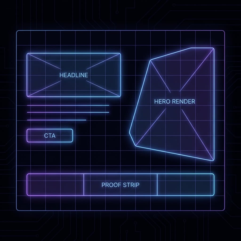
| Element | Job | Placement |
|---|---|---|
| Hero render | Show the product in one decisive moment | Dominant column with the larger share of width |
| Headline | Name the outcome and audience | Top left of copy stack |
| Subhead | Add proof, metric, or time-to-value | Directly under headline |
| Primary CTA | Make the next step obvious | Below subhead, above any secondary links |
| Proof strip | Reduce risk in one glance | Under CTA or aligned with hero base |
Above-the-fold copy formula
- Headline: Outcome + audience + time frame.
- Subhead: Proof + differentiation + result speed.
- CTA: Verb + value object, not a generic “Submit”.
- Proof strip: A short list of micro proofs like reviews, guarantees, or results.
Example: “Launch a studio-level hero render fast.” “Built for ecommerce teams who need quick conversion wins.” “Start with a free render.”
Manual build: the hero render system
Most teams jump straight to copy tweaks. The real conversion lift comes from the hero render. You are not just choosing a pretty image. You are choosing the visual proof for your promise.
- Define the single product moment. If you sell cookware, it is the pan with finished food, not the empty pan. If you sell a supplement, it is the before and after benefit, not the bottle alone.
- Pick a camera angle that matches intent. Top-down works for kits and flat lays. Eye level sells durability and presence. Slight 3 quarter angles show depth and materials.
- Build a distraction-free background. Above the fold needs contrast. Busy scenes reduce the odds your headline gets read.
- Lock your light direction. If your shadows go two directions across the page, the hero feels fake. Use one dominant light source and mirror it in any icons.
- Keep the product label legible. The brand name is part of the trust signal, so do not crop it out.
- Design for mobile crop. The hero should still make sense at common mobile widths. Create a safe zone for the product and CTA.
- Pair with a proof strip. Reviews, guarantees, shipping speed, and certifications reduce friction without extra paragraphs.
Proof strip ideas
- Star rating and review count.
- Free returns or risk-free trial.
- Fast shipping or delivery window.
- Certification or guarantee badge.
Mobile crop preview
If the product or CTA disappears on mobile, the hero loses. Always design a mobile safe zone first.

If this manual process sounds like a lot, that is because it is. This is why many teams end up with generic hero images and weak conversions.
The 3-second clarity test
Run this quick test before you invest in traffic. It will save you from paying for clicks that bounce.
How to run it
- Open the landing page on mobile and desktop.
- Show the screen for three seconds to someone who has not seen it.
- Ask them to describe what the product is, who it is for, and what to do next.
- If they miss any of the three, the hero is not clear enough.
Your goal is not to make the user read. Your goal is to make them understand without thinking.
Interactive: Above-the-Fold Clarity Scorecard
Use this scorecard to diagnose which part of your hero is weak. This is a heuristic, but it mirrors the real decisions users make in the first few seconds.
Above-the-Fold Clarity Scorecard
Rate your hero in under two minutes. This is a heuristic, not a lab test.
Proof signals present
Clarity score
Most visitors will bounce because the value is not immediate.
Estimated time it takes a new visitor to understand your offer: 7 seconds or more.
Attention-weighted score: 28 out of 57.
Priority fixes
- • Rewrite the headline to name the outcome and the audience in one line.
- • Add a quantified benefit or time-to-value in the subhead.
- • Swap the hero render for a single, undeniable product moment.
- • Increase CTA contrast and place it next to the headline.
- • Create a mobile crop so the product and CTA stay above the fold.
- • Add at least two proof signals within the first screenful.
Want a faster hero rebuild?
Rendery3D generates consistent hero renders that fit your above-the-fold layout in minutes.
Generate a new hero renderCommon mistakes that kill hero performance
- Lifestyle without the product. If the hero looks like a stock photo, the product feels optional.
- Multiple CTAs. A second CTA is fine below the fold, but not in the hero.
- No proof above the fold. A headline without evidence reads like hype.
- Mismatch between ad and hero. If your ad promises a benefit and the hero shows a generic product shot, trust drops.
- Heavy images that delay paint. A slow hero is a silent conversion killer.
Related resource
- Product photo consistency audit for visual trust signals that reinforce the hero.
Advanced optimizations for high intent traffic
Once the hero works, scale performance with high intent tweaks. These are the changes that lift conversion without rewriting the page.
- Message match the ad. Use the same phrase in the headline that appears in your ad copy, so users feel continuity.
- Contrast the CTA with the hero render. If your hero is warm, use a cool CTA. If it is dark, use a bright CTA.
- Test hero variants first. In most ecommerce funnels, the hero render drives more lift than button copy alone. Pair with the A/B testing image playbook.
- Reduce above-the-fold choice. Hide the full nav if the page is for paid traffic. One action is enough.
- Lead with a proof badge. A small row of reviews or certifications below the CTA reduces anxiety without extra copy.
Fast test plan
- Test hero render A vs B first.
- Then test headline clarity.
- Finally test CTA copy and button color.
Video breakdown of a high-converting hero
Use this video to see how a hero render, headline, and CTA work together in the first screenful.
How Rendery3D makes this easy
Now, all of this might sound overwhelming. And honestly, doing it manually is time-consuming. That is why we built Rendery3D.
- Hero-ready renders in minutes. Generate a new hero visual with the right lighting, angle, and background so it fits your layout the first time.
- Label and logo preservation. Your product branding stays intact, which keeps trust signals above the fold.
- Flexible aspect ratios. We default to 1:1 for marketplaces, but you can override to 16:9 for landing pages.
- Rapid variant testing. Create multiple hero options so you can test what converts instead of guessing.
Next steps
- AI product photography to generate hero-ready visuals.
- Product photo generator to create fast hero variants.
- Rendery3D pricing for volume-based plans.
- Free trial signup to start testing today.
Summary checklist for your next hero render
- One message, one hero render, one CTA.
- Headline explains outcome and audience in a single line.
- Subhead adds proof or time-to-value, not fluff.
- Product label is visible and legible.
- Proof strip sits above the fold on mobile and desktop.
- Hero loads fast and is sized for the first paint.
- Mobile crop keeps the CTA and product in the safe zone.
FAQs about above-the-fold design
How tall should the hero be?
Start with a hero tall enough to keep the headline, CTA, and proof strip visible without scrolling on common devices, then test and refine.
Do I need a video hero?
Only if the product requires motion to understand. A static hero render with clear benefits is faster, lighter, and usually converts better for ecommerce.
Where should social proof go?
Put a small proof strip under the CTA or just beneath the hero on mobile. It should be visible without scrolling on at least one device size.
What is the fastest win if my hero is weak?
Swap the hero render first. A sharper product moment usually beats a copy rewrite in terms of conversion lift.